qiktube design system

Styleguide.

A dark, broadcast-flavoured system for a video platform where influencers own their audience and fans get a say. Warm near-black surfaces, cream text, one signal orange for action and the Tandem layer, and a calm blue for the fan side.

Content firstVideo and people carry the page. Chrome stays quiet and dark so thumbnails pop.
One action colorOrange means “do this” or “this is the Tandem layer”. Never decoration.
Type does the shoutingWide, heavy Archivo headlines replace hero imagery. No photo backdrops.
State is semanticSelected states are driven by aria-pressed, aria-current and hidden.

Color

All colors are CSS custom properties on :root in assets/css/qiktube.css. Contrast ratios below are WCAG 2.x, computed against the surface named.

Surfaces
Ink 950--ink-950 #0C0B0EPlayer letterbox
Ink 900--ink-900 #121014Page background
Ink 850--ink-850 #16141ABoard cards
Ink 800--ink-800 #1A181ECards, panels
Ink 750--ink-750 #1C1A20Inputs, SSO
Ink 700--ink-700 #24212AHover, selected, replies
Lines
Line 600--line-600 #2A2630Hairlines, section rules
Line 500--line-500 #36313DInput borders
Line 400--line-400 #3A3540Chips, tags
Line 300--line-300 #4A4452Ghost buttons
Text on dark
Text 100 · Cream--text-100 #F2EEE6Primary · 16.35:1
Text 200--text-200 #DCD5CASecondary · 12.99:1
Text 300--text-300 #CFC8BCTertiary
Text 400--text-400 #B8B0A4Body muted · 8.82:1
Text 500--text-500 #A39B8FCaptions · 6.89:1
Text 600--text-600 #8F887DPlaceholders · 5.39:1
Brand
Signal orange--accent #FF6A2BPrimary action, Tandem layer. 6.62:1 on Ink 900
Accent ink--accent-ink #1A0F08Text on orange · 6.59:1
Accent soft--accent-soft #FFB08ALinks, focus ring · 10.66:1
Fan blue--blue #6FA0E8Fan side, “against” share, upvotes
Fan blue soft--blue-soft #8DB8F2Fan eyebrows · 9.25:1
Blue ink--blue-ink #0E1220Text on blue · 6.99:1
Cream band and tints
Cream ink--cream-ink #18161BText on cream · 15.52:1
Cream muted--cream-muted #3D3830Body on cream · 10.04:1
Cream caption--cream-caption #5C554BCaptions on cream · 6.35:1
Warn surface--warn-surface #1E1513Pain point, figure #FF8A5C
Info surface--info-surface #131A22Pain point, figure #8DB8F2
Avatar fallbacks (initials)
TERUVINAOL#2F6B63 · #9A4420 · #5B3F8C · #3E5C8A · #6B5A2A

Data pairs (For vs Against, Mara vs Dev) always use orange vs blue, which differ in lightness as well as hue, so they read for color-blind users too.

Typography

DisplayArchivoVariable: weight 100–900, width 62–125%. Used at width 125% (headlines) and 112% (card titles). Weights 700, 800, 900.
Body / UIGeistVariable: weight 100–900. Used at 400 (body), 500 (nav), 600 (buttons, labels), 700 (emphasis).
Meta / labelsGeist MonoStatic 400 and 500. Eyebrows, durations, tags, track labels. Usually uppercase with 0.06–0.1em tracking.
Hero
Archivo 900 · 125%
clamp(56px,10vw,156px)
lh .9 · ls −0.045em
Own your audience!
Home headline
Archivo 800 · 125%
clamp(36px,5.2vw,76px)
lh .98 · ls −0.03em
Where influencers and fans meet.
Banner
Archivo 900 · 125%
clamp(40px,6vw,92px)
lh .92 · ls −0.04em
No more strikes.
H2 section
Archivo 800 · 125%
clamp(32px,4vw,54px)
lh 1 · ls −0.03em
Every subscriber is yours.
H2 small (row titles)
Archivo 800 · 125%
36px · lh 1.05
New from your creators
Slide title
Archivo 800 · 112%
clamp(30px,3.6vw,48px)
Is the suburb dead?
H3 card title
Archivo 800 · 112%
22–28px · lh 1.1
What is a Circle?
Lead
Geist 400
clamp(18px,1.6vw,22px) · lh 1.45

One copyright claim shouldn’t cost you a channel you spent years building.

Body
Geist 400 · 16px · lh 1.5
Muted body 18px #B8B0A4

See who follows you, export the list whenever you want, and write to them directly.

Small / caption
Geist 14px / 13px

Reaches every fan you send it to.

Eyebrow
Geist Mono 13px · uppercase
ls 0.1em
Own your audience
Mono tag
Geist Mono 12px · uppercase
ls 0.08em
Tandem · 18:42

Rules: headlines use text-wrap: balance, paragraphs use text-wrap: pretty. Keep line length under ~70 characters (max-width 560–720px). Never set body copy in Archivo.

Font files

All three families are self-hosted in assets/fonts/ (latin subset, WOFF2) and licensed under the SIL Open Font License 1.1. License texts ship next to the files. The two variable files are preloaded in every page head.

FamilyFileAxes / weightsDesignerLicense
Archivoarchivo-variable.woff2wght 100–900, wdth 62–125%Omnibus-TypeLICENSE-Archivo.txt (OFL 1.1)
Geistgeist-variable.woff2wght 100–900VercelLICENSE-Geist.txt (OFL 1.1)
Geist Monogeist-mono-400.woff2, geist-mono-500.woff2400, 500VercelLICENSE-GeistMono.txt (OFL 1.1)

Fallback stacks: display "Arial Narrow", "Helvetica Neue", sans-serif; body "Helvetica Neue", Helvetica, sans-serif; mono ui-monospace, SFMono-Regular, Menlo, monospace. To use Google Fonts instead, replace the @font-face block with family=Archivo:wdth,wght@62..125,400..900&family=Geist:wght@400..700&family=Geist+Mono:wght@400;500.

Spacing, radius, elevation

Spacing scale (px)
4
8
12
16
20
24
32
48
56
72
96

Component gaps: 8–16. Card padding: 20–24 (32 for pain points). Section padding: 56 (home rows), 72 (landing sections), 96 (hero top). Between sibling sections, a 1px --line-600 rule.

Radius
xs 6 · tags
sm 8 · insets
md 12 · inputs
lg 14 · thumbs
xl 16 · cards
2xl 18 · panels
4xl 24 · bands, slides
pill · buttons, chips
Elevation

Flat by default: separation comes from surface steps and hairlines. Shadows only on things that float over video: --shadow-layer 0 18px 40px rgba(0,0,0,.5) for the Tandem layer, --shadow-thumb 0 10px 24px rgba(0,0,0,.4) for thumbnail insets. Scrim over video: rgba(12,11,14,.82).

Layout and breakpoints

  • Container: max-width 1360px, side gutter 32px, 16px below 640px.
  • Grids are intrinsic, not breakpoint-driven: .grid uses repeat(auto-fit, minmax(min(var(--min), 100%), 1fr)). Typical --min: 240 (circle cards), 280 (video cards), 340 (board), 420–460 (two-up panels).
  • .split: section title left, supporting paragraph right, collapses to one column under ~900px.
  • Heroes are single column. Never pair a hero headline with an image column.
  • Wide tables scroll inside .table-wrap; the page itself never scrolls sideways.
  • Touch targets are at least 44px tall (buttons, chips 36–40px have 44px rows around them; dots use a 44px hit area).

Components

Buttons

One primary (orange) action per view. Ghost for the secondary action. Light (cream) for actions over imagery. Labels are verbs: “Claim your channel”, “Join free”, “Watch in Tandem”.

Chips and toggles
Social sign-in

The dashed 22px square is a logo slot. Replace it with each provider’s official sign-in mark from their brand kit, and follow their button rules (some providers require specific colors or label wording such as “Sign in with …”). Order: Google, Facebook, LinkedIn, TikTok, then email.

Cards

What is a Circle?

Informational card. Cream, always first in its row.

What is a Tandem?

Accent informational card for Tandem explainers.
Mara OkaforUrbanism
Inner circle
Video card and badgesVote bar
For Against
Inputs

Tandem visual language

A Tandem is always drawn as two layers. The base (the original) is plain. The response layer always carries a 2–3px orange border; orange means “this is the Tandem layer” everywhere. Use the same three layouts the editor offers.
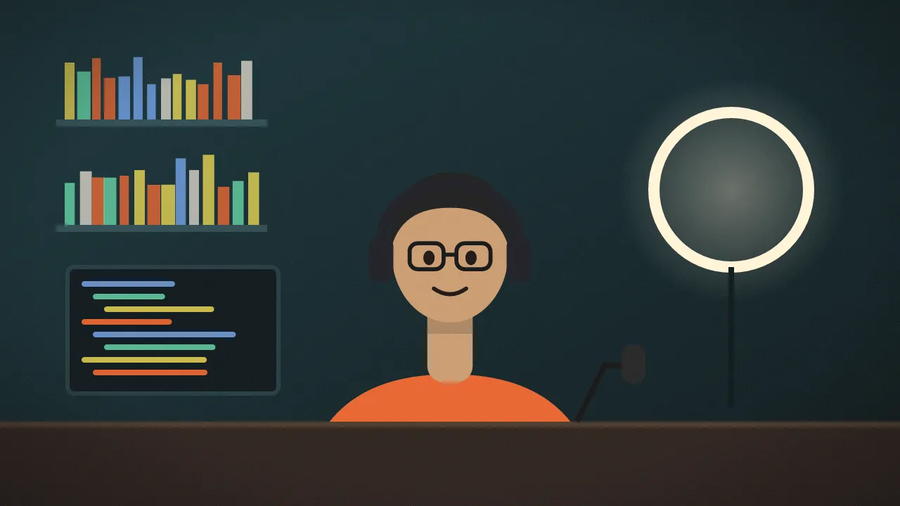
data-mode="overlay" · layer 42% wide, bottom-right
data-mode="side" · works in every browser
data-mode="pip" · layer 24% wide, top-right

Two-track timeline: base track in cream, response track in orange, offset to where the response starts. Credit lines read “Creator A × Creator B” with an overlapping avatar pair.

Imagery and icons

Do
  • Show images only where they are content: thumbnails, the Tandem player, channel banners, avatars.
  • Keep 16:9 for video, 16:7 for card covers, 1:1 for avatars.
  • Use inline stroke icons (2–2.6px stroke, round caps) in currentColor.
  • Put a solid scrim chip behind any text that sits on video.
Don’t
  • Use photos or video mosaics as section or hero backdrops. It creates visual noise.
  • Use gradient washes, emoji or left-border accent cards.
  • Draw third-party logos yourself. Use official brand assets.
  • Put orange borders on anything that is not a Tandem layer or a primary action.

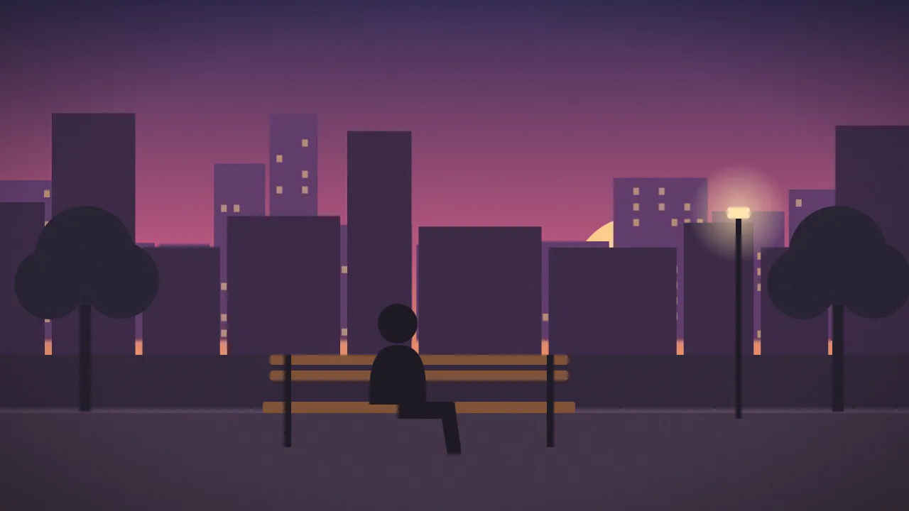
The illustrated stills and avatars in assets/img/ are placeholders. Replace them with real thumbnails and creator photos at the same aspect ratios.

qiktubeLogo mark: outlined frame (the original) overlapped by a filled orange frame (the Tandem layer). Wordmark: Archivo 800, width 125%, lowercase.

Voice and copy

Do
  • Speak to the reader’s real problem: strikes, not owning subscribers, no say.
  • Short declaratives. “Own your audience!” “The Square decides.”
  • Capitalize product nouns: Circle, Tandem, Topic, Board, Town Square.
  • Mark missing facts as placeholders, e.g. [YOUR PRICE].
Don’t
  • Invent stats or testimonials.
  • Promise live features that don’t exist yet (no live rooms, no “live now”).
  • Name a specific platform’s strike policy unless it is quoted and current.
  • Use filler like “Welcome to our website”.

Accessibility

  • Every text/surface pair above meets WCAG AA (4.5:1 or better); the lowest used is placeholder text at 5.39:1.
  • Real elements only: <button>, <a href>, <input> with a <label>. Icon-only buttons carry aria-label.
  • Toggles use aria-pressed; the carousel uses aria-roledescription, labelled slides, aria-current dots and arrow-key support; the Tandem mode note is aria-live="polite".
  • Focus ring: 2px --accent-soft, 2px offset, on every interactive element.
  • prefers-reduced-motion disables transitions.

Files and structure

qiktube-web/ ├── index.html            Home: carousel, latest, Circles, Tandems, Board ├── influencers.html      “Own your audience!” ├── fans.html             “The new Town Square” ├── styleguide.html       This page └── assets/ ├── css/qiktube.css   Tokens, base, layout, components ├── js/qiktube.js     Carousel, toggles, votes, Tandem modes, Topics ├── fonts/            Archivo, Geist, Geist Mono (WOFF2 + OFL licenses) └── img/              Placeholder video stills and avatars (WebP)

No build step and no dependencies. Open index.html directly or serve the folder with any static server. JS behaviour is attached through data attributes (data-carousel, data-toggle, data-radio, data-vote, data-upvote, data-tandem-modes, data-topics), so markup can move into any framework unchanged.